
The identity,
defined.
Purpose. This manual defines how DLHF should look, read, feel and behave across website, sales material, newsletters, presentations, proposals, campaigns, social communication, photography, generative media and professional representation.
DLHF is an independent high-end commercial, creative and professional practice. The identity combines fine editorial culture, commercial intelligence, creative distinction and professional execution. It should never feel like a generic agency, mass-market consultancy, template website or AI-content factory.
01 · Core character
- Fine, cultivated and sophisticated
- Commercially intelligent
- International rather than provincial
- Editorial rather than advertising-led
- Confident without being loud
- Creative without becoming decorative
- Professional without becoming corporate-generic
- Human, observant and occasionally literary
- High-end through execution, not claims
- Profit-oriented and commercially relevant
02 · Governing principle
Expensive through quality — not decoration.
Perceived value is created through typography, writing, imagery, materials, spacing, proportion, detail, thinking and execution. Luxury is not simulated with gradients, gold effects, gloss, excessive ornament or the repeated use of the word “premium”.
03 · Tone of voice
- Professional
- Intelligent
- Cultivated
- Precise
- Observant
- Articulate
- Commercial
- Insightful
- Elegant
- Occasionally literary
- Useful to read
- Persuasive without chasing
04 · Writing rules
- Write complete thoughts, not slogan chains.
- Use specific language instead of generic superlatives.
- Allow a strong sentence to stand alone.
- Use italics to introduce nuance and literary rhythm.
- Use highlighted words sparingly for emphasis.
- Use small uppercase labels to orient the reader.
- Avoid artificial urgency and hard-sell language.
- Avoid formulaic AI phrasing.
- Avoid “unlock”, “next level”, “game-changing” and empty luxury vocabulary.
- Commercial writing must explain value, not merely announce it.
05 · Typography
Linotype Didot (web family linotype-didot) — the approved two-line page and chapter signature, matching AI:U.
Playfair Display — ordinary content headings, editorial statements, service titles and prominent figures. It must not replace Didot in the signature.
EB Garamond — body copy, long-form reading, explanations and editorial text.
Lamar Pen — handwritten human voice for short annotations, observations and signatures only.
Times / Times New Roman are not part of the defined DLHF system.
06 · Colour system
The permanent identity is monochrome and warm-neutral. Colour primarily enters through photography, artwork and materials rather than bright interface accents.
#171717
#111111
#FFFFFF
#F4F1EA
#DEDEDE
#AAAAAA
Dark fields: headings #DEDEDE; supporting labels #AAAAAA; body copy approximately #C9C9C9. Never use dark-grey headings on a dark field.
07 · Layout
- Large editorial statements with substantial negative space
- 50/50 image-and-copy compositions
- Full-width or near-full-width photography
- Thin horizontal rules as structural devices
- Occasional black editorial fields
- Asymmetric editorial compositions
- Tables for structured factual information
- Accordions for detailed secondary information
- Wordscapes for breadth and cultural range
- Diagrams/models where relationships need explanation
- Grids only where information is genuinely comparable
- Avoid repetitive card walls
08 · Photography
- Authored, high-resolution and editorial
- Natural skin and believable materials
- Fine architecture, interiors and environments
- Controlled shallow depth of field where appropriate
- Atmosphere and narrative over generic posing
- International hospitality, commerce and quality-of-life context
- Restrained colour and sophisticated tonal control
- Avoid obvious stock photography
- Avoid visible AI artefacts
- Avoid cheap corporate imagery
09 · Generative media
Generated material must feel commissioned, art-directed and finished. The DLHF Creative Library is used to preserve successful combinations of medium, composition, light, colour, detail, texture and mood.
Method: Medium + Composition + Light + Colour + Detail + Texture + Mood → test → refine → curate → save → reuse.
10 · Graphic language
- Fine black rules
- Monochrome diagrams
- Editorial tables
- Simple premium iconography
- Strong hierarchy without visual noise
- Large photography against restrained text
- Black fields used as punctuation
- Classical proportions with contemporary spacing
- No cheap metallic effects
- No glow, neon or SaaS-style gradients
11 · Commercial philosophy
Sales is not pressure. Professional sales makes relevant value understandable and commercially actionable. DLHF communication should reflect preparation, research, needs analysis, credibility, representation, attractive presentation, dialogue, negotiation, implementation and follow-through.
Relationships are commercial capital: trust, familiarity, access, information, recommendations, repeat business, introductions and opportunities continue beyond the transaction.
12 · Quality test
Before publication ask: Does this look, read and feel as though exceptional care, taste, knowledge and professional ability went into making it?
If the answer is no, it is not finished.
Brands are quality promises. People are brand ambassadors. Policies define professional success.
This demonstrates the large statement language used on Start and Newsletter Producer: fine rules, very large serif typography, italics for nuance and a single reversed phrase for emphasis.
Elevate the commercial experience.
A principal DLHF layout pattern. One half carries editorial copy; the other gives a strong photograph enough scale to establish atmosphere. Supporting information can be separated by thin rules rather than boxed cards.
The presentation becomes part of the value before the customer has tested the product. It should therefore receive serious attention.
A white editorial statement field: use for philosophy, commercial observations, positioning and memorable conclusions.
One field. Several responsibilities.
COMMERCIAL
- Value proposition
- Sales & B2B
- Needs analysis
- Negotiation
- Relationship development
CREATIVE
- Copywriting
- Photography
- Generative media
- Graphic production
- Editorial direction
PROFESSIONAL
A larger statement may occupy the final column rather than another list. This creates the asymmetry visible in DLHF's established black information sections.
One identity. Many expressions of value.
This device communicates breadth without reducing everything to a conventional service list.
The four typographic voices.
Ordinary content headings, editorial statements, service titles and figures. Signature page and chapter headings use Linotype Didot.
The fixed two-line page and chapter signature. Match the approved AI:U reference; use selectively for other agreed editorial expressions.
Body copy, editorial text, explanations and longer commercial writing.
Short handwritten notes only. This specimen is configured for the Adobe Fonts Lamar Pen family; the Adobe web project must expose the family to the domain for the genuine face to render.
Good taste is often visible in what has deliberately been left out.
Space is part of the identity.
All headings on dark fields use Light Grey #DEDEDE. Supporting labels use #AAAAAA. Body text uses approximately #C9C9C9.
Photography, atmosphere and authored creative media.
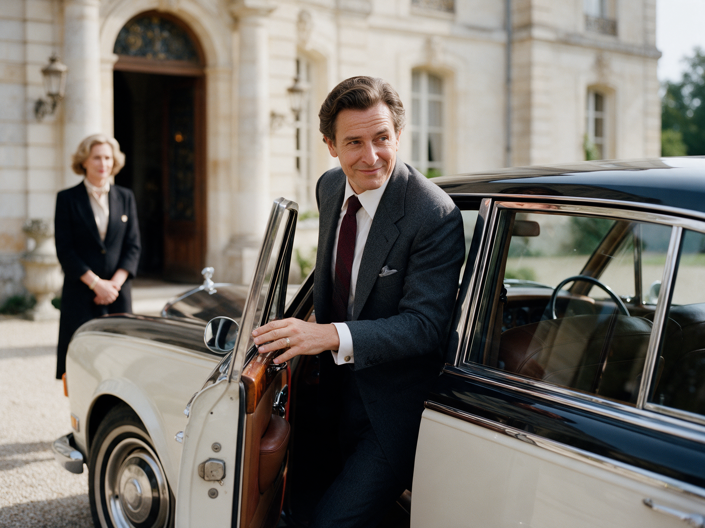
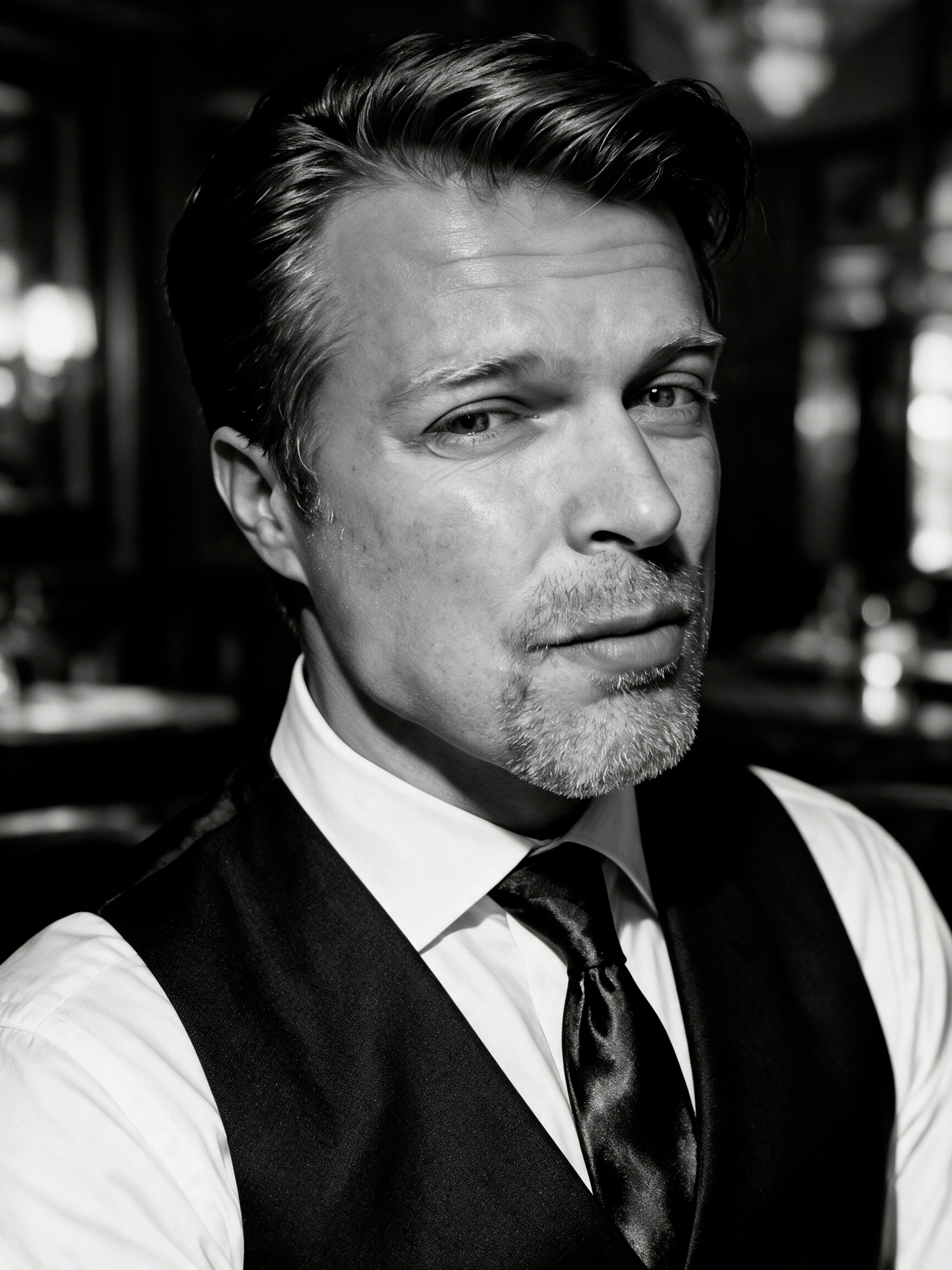
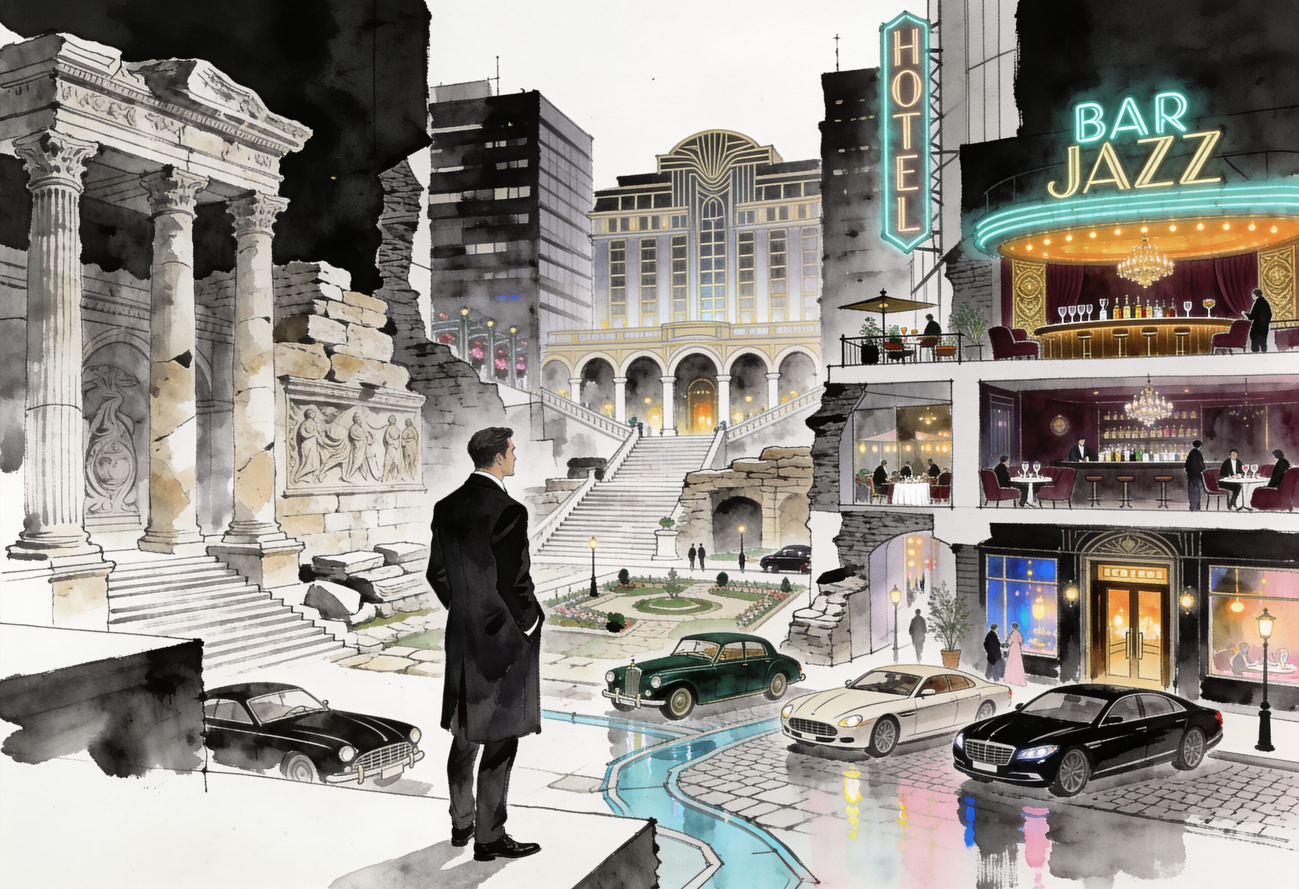

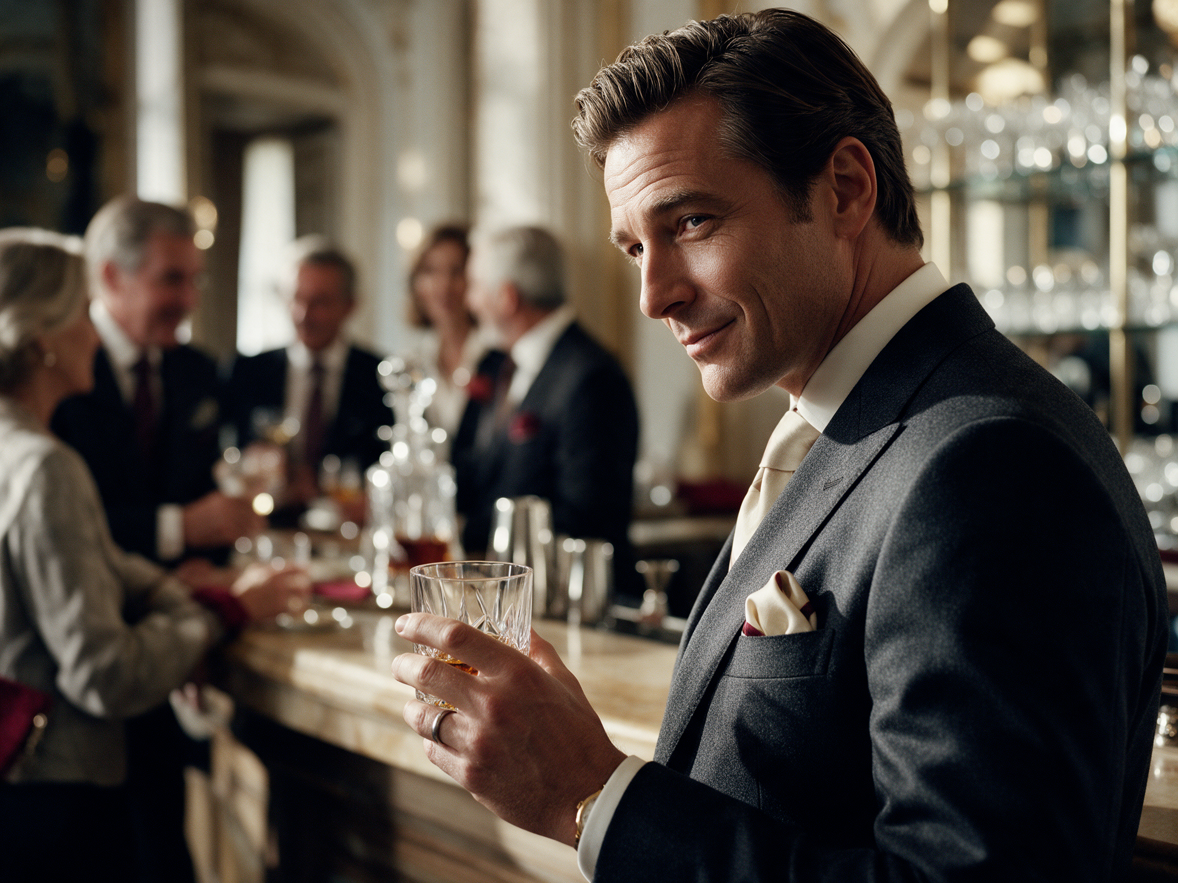
The large/small composition demonstrates how visual material should be curated as an editorial sequence rather than presented as a uniform thumbnail gallery.
Named styles and verified directions.
The list below separates styles that were explicitly created/named in earlier DLHF work from broader directions. It should not invent historical presets that were never established.
Nordic Cinematic
Reusable commercial photographic direction: cool neutral daylight, ivory/silver/charcoal palette, natural skin, restrained colour, fine grain and optical bokeh. Developed for Magnific / Seedream production.
Regal Business
Executive and business imagery with elegant architecture/interiors, cooler and less saturated colour, extreme shallow depth of field and refined bokeh. Designed to make professional scenes feel expensive without corporate cliché.
Luxury Lifestyle Editorial
Narrative luxury-lifestyle and fashion-editorial imagery: people, place, material, atmosphere, sophisticated composition, shallow depth of field and a sense of lived experience.
DLHF Editorial Art / Ink & Charcoal
Monochrome authored artwork using drawing, graphite, ink wash and charcoal characteristics with restrained editorial finishing. Suitable for diagrams, conceptual art and premium visual communication.
Contemporary Digital Art / Modern Art Rebellion
Contemporary digital-art direction developed through art-historical fusion, layered surface treatment and graphic intervention; used for more expressive standalone artworks.
DLHF Signature / hybrid styles
Successful combinations can be saved as reusable styles. Earlier library work included graphite + ink wash, luxury editorial photography, subtle compositing, medium-format fashion portrait characteristics, fine-art print texture and restrained grain.
When information is factual, let structure do the design.
| Element | Use | Rule |
|---|---|---|
| Large statement | Philosophy, positioning, memorable commercial insight | Generous space; one idea; optional italic or reversed emphasis. |
| 50/50 composition | Service, capability, profile, narrative | One substantial image + one disciplined copy field. |
| Black field | Hierarchy, interruption, concentrated information | #171717 background; #DEDEDE headings. |
| Wordscape | Breadth, culture, subject range | Vary scale and emphasis without turning into decorative chaos. |
| Table | Comparisons and factual reference | Fine rules; minimal fill; editorial typography. |
| Accordion | Secondary detail | Simple +/− interaction; no heavy UI styling. |
| Diagram | Systems, hierarchy and relationships | Monochrome, clear logic, premium restrained execution. |
Detailed rules without visual overload.
01 · Do — visual presentation
- Use large images and real visual pauses.
- Let empty space create hierarchy.
- Alternate scale and density across a long page.
- Use thin lines and classical typography.
- Use black fields strategically.
02 · Don't — visual presentation
- Do not build the entire page from equal cards.
- Do not use repeated rounded boxes.
- Do not introduce bright interface colours.
- Do not make every section equally dense.
- Do not use dark-grey headings on black.
03 · Do — language
Be precise, observant, intelligent and commercially useful. Allow elegance and literary expression where it improves meaning.
04 · Don't — language
Avoid inflated claims, generic agency language, forced excitement, artificial urgency and formulaic AI constructions.
Observation → research → need → value → proposition → presentation → dialogue → negotiation → agreement → implementation → experience → relationship → development.
This linear editorial model is the preferred treatment when the relationship between stages matters more than individual cards.
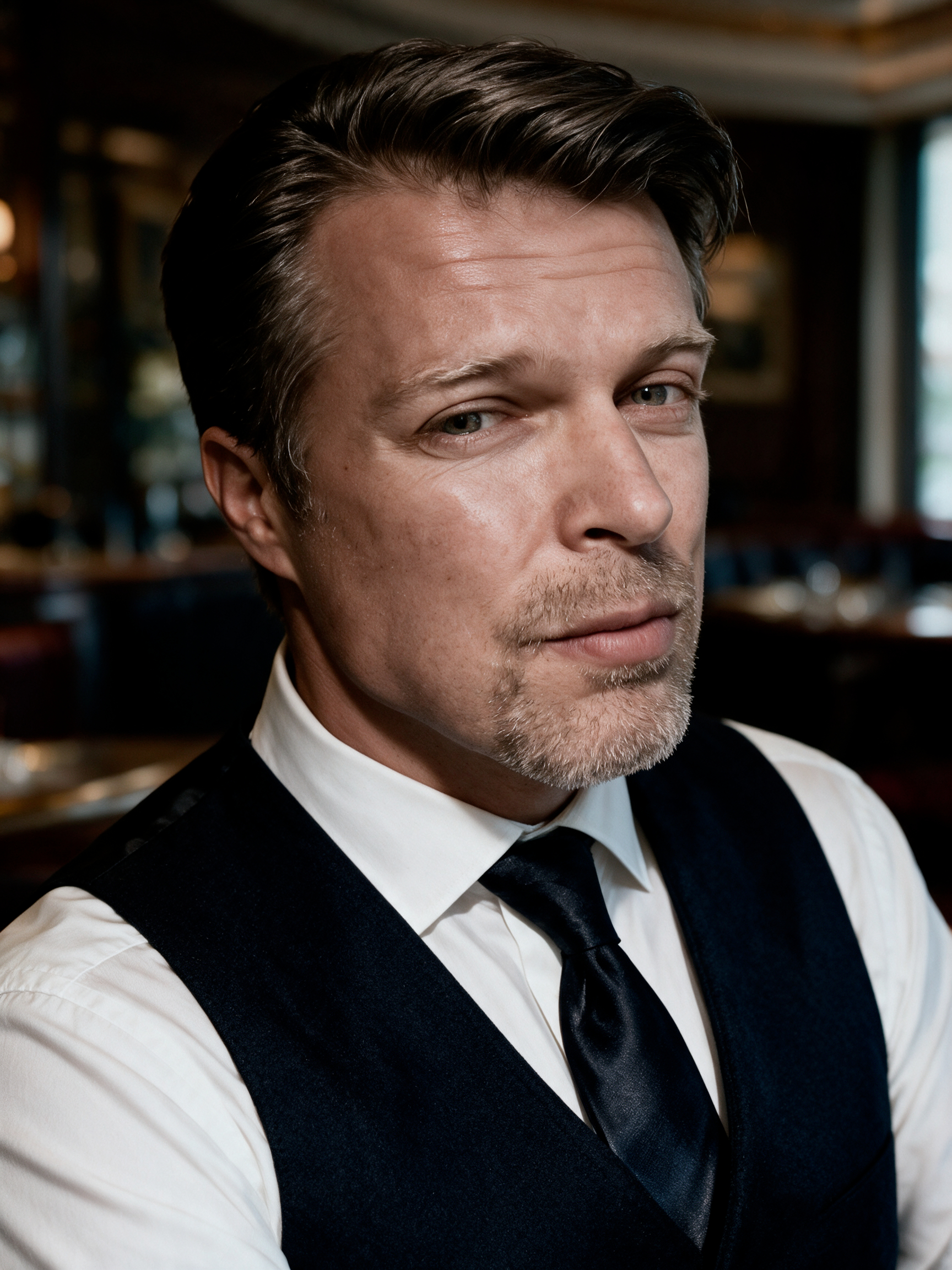
Industry professional.
People should appear capable, composed and situated in believable professional or hospitality environments. The image and copy should together communicate proficiency, judgement and social confidence rather than generic corporate ambition.
Success is earned through excellence: quality in every detail, sound commercial judgement, professional management, genuine proficiency, thoughtful communication and consistent execution.
Fine. Cultivated. Intelligent. International. Commercially relevant. Beautifully produced.
Every DLHF output should be recognisable by the standard of thought and execution before it is recognised by a logo.
Understand value. Create it intelligently. Present it beautifully. Deliver it professionally.
Quality should be visible before it is explained.